Today, the retail food industry is one of the most competitive consumer industries. Shelf presence can make or break aspiring or even established food brands. One of our favorite pastimes is selecting what we consider some of the most interesting and compelling food label designs — especially those that distinguish themselves in this industry’s highly competitive and niche markets.
Enjoy Ten Favorite Food Labels
Enjoy as we share some unique, distinctive, and interesting designs. As a food label converter, we hope these can help inspire you as you engage your own food brand clients.
1. Kodiak Cakes Oatmeal
For years, consumers have taken oatmeal for granted — an established market dominated by a single brand. Kodiak Cakes blows away those preconceptions with its bold, earthy label designs. Its powerful bear icon pulls away the traditionally friendly façade with which consumers are familiar to drive home the value of a new and delicious take on this staple food.
2. Local Hive Honey
Local Hive Honey’s assorted labels feature intricate designs that highlight the cultural and regional relevance of each of their products, despite their uniformity as part of a single brand. These designs are a welcome break from the modernized, simplified designs of modern honey labels, which often feature color minimalism and product transparency over color vibrancy and design prominence.
3. Lily’s Kitchen Food for Dogs
Lily’s Kitchen labels are distinctive for their colorfully drawn images in a market where animal photos superimposed with branded content are now common. Depictions of nature align with the brand’s emphasis on health, sustainability, and recyclability. Colors, ingredients, and product names represented in the designs are sure to play upon the appetites of human beings who shop the products as well.
4. eat17 Bacon Jam
The label for eat17’s bacon jam is as unique as its product. It’s bright-pink background spans the gap between protein and produce; its oversized white text and prominent swine design leave nothing to the imagination as to what’s inside. This quirky label is sure to stand out on any shelf of jams.
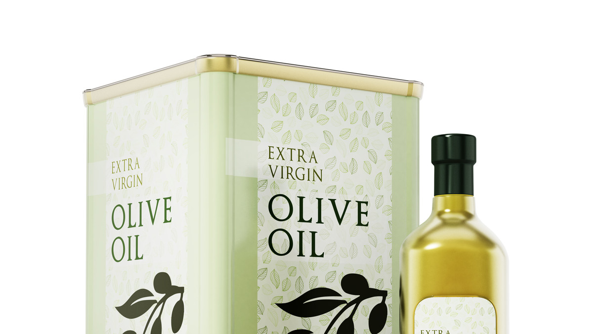
5. Olivus Floris Virgin Olive Oil Products
The labels for Olivus Floris olive oils demonstrate how color, typeface, and transparency can combine to create a compelling message about a food product without taking up a lot of packaging space. Simple colors distinguish the brands’ varied infused olive oil products while demonstrating its naturalist style and minimalist-modern design.
6. Fairlife Milk Products
Fairlife’s brand and product designs are different yet distinguished in an already crowded sector of the retail food industry. Fairlife’s friendly-looking milk products feature color simplicity and a modern, information-forward design. Products distinguished largely by color alone make the Fairlife line an excellent example of design variation as part of a unified brand.
7. Cajohn’s Lethal Ingestion Hot Sauce
We couldn’t list the best food labels in good faith without including a hot sauce. There are countless compelling hot sauce label designs, but Cajohn’s Lethal Ingestion label is among the most interesting. Borrowed from the heavily regulated science labeling field, the context and humor of Cajohn’s label is immediately recognizable. This conformed yet out-of-place style is easily distinguishable among product labels that are often heavy on individuality and flare.
8. Sir Kensington’s Ketchup and Assorted Condiments
Much like Fairlife’s products, Sir Kensington’s condiments disrupted an already crowded market centered on only a handful of legacy brands. Based on their mission to “bring integrity and charm to overlooked food,” Sir Kensington’s product labels feature a gentle and appealing modern color palette and design with a nod to old-timely products indicative of artisanal quality and taste.
9. Dave’s Killer Bread
The labeling of Dave’s Killer Bread products breaks out from the typecast of today’s organic food label designs, providing its audience with a taste of Americana as part of a bold and irreverent style. The label lets the hearty product speak for itself with flat colors, simple art, and a lot of transparency. Dave’s features an information-forward design that delivers the data for a health-conscious audience.
10. Halo Top “Dairy Light” Ice Cream
Halo Top promises the joy of ice cream without the guilt, even among those of us who can’t help but eat the whole pint. The products’ vibrant yet limited color combinations capture the eye in a crowded grocery store freezer section, enticing shoppers to learn more. Shoppers don’t have to look far since pertinent nutrition information is front and center — unusually pronounced compared to its traditional ice cream competitors. Calories are listed on the front of the label “per pint” rather than “per serving,” offering true ice cream lovers the information they truly need.
Great design, great printing go hand in hand
It’s a thrill to see what designers and their food label converter partners produce in this creative and dynamic field. At Epson, we’re glad to be part of the team among food label converters around the world.
Want to learn more? You can visit Epson.com/SurePress any time or speak directly with an Epson SurePress expert by calling:
Western U.S. (818) 620-2730 | Central U.S. (630) 710-6005 | Eastern U.S. (615) 585-9058
![]()