Craft beer product labels feature some of the most exciting design and professional print elements in modern consumer goods manufacturing. Creating these eye-catching labels is both a challenge and a delight for designers. The same goes for converters, who are responsible for the consistent rendering of their wildly unique and color-diverse imagery — from the very first label to the last.
At Epson, we understand the creativity, precision, and effort that go into the most effective and compelling craft beer labels. We also have our own opinions about which are the most impressive examples for all these reasons. This article features our reviews of the best craft beer label designs of 2021—from both consumer and print industry perspectives.
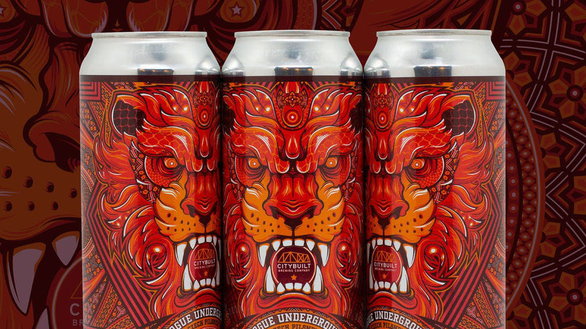
1. Prague Underground – CityBuilt Brewing
With credit to designer Elliot Chaltry, CityBuilt Brewing’s Prague Underground label design features an engaging splash of color and a highly intricate visual experience. The award-winning label itself has multiple layers, which consumers can sense upon touching the can. From a print standpoint, the white ink of the lion’s teeth stands out especially, as does the precision of the label’s white text, much of which is fine print. And, harder to see online, but quite striking in the original, CityBuilt has made creative use of spot varnish capabilities to make the design POP.
2. Chef’s Beer – Varionica
The label of Varionica’s Chef’s Beer features an enticing minimalist design with gold trim, making a clear statement of purpose, context, and class. The textured nature of the gold features against a field of white gives the otherwise simple style a distinct visual and tactile finish. The design concept also provides a unique context that helps the product stand out.
3. Bimini Bay – Tripping Animals Brewing
The label of Bimini Bay by Tripping Animals Brewing takes context in a whole different direction. The label features an otherworldly blend of color and psychedelic styles that’s nonetheless consistent with the brewer’s recurring animal theme. The use of color boasts extremely high precision with a standalone artistic rendering of a squid against closely bound threads of vibrant colors in the background.
4. Stoneface – Big Mean Brewing Co.
Modern minimalism meets classic Greek styles in the label of Stoneface by Big Mean Brewing Co. The intriguing yet approachable design features expertly laid black ink on an eggshell background — highly precise even with such closely laid lines within the circular Greek pattern, with the Medusa image overlapping it.
5. Pump It Up – Fifth Frame Brewing Co.
The Pump It Up label features a photorealistic use of design and color that takes on a life of its own — challenging the consumer and appearing ready to bounce off the shelf. Highly complex color arrangements also present a varnished metallic texture, possibly through a digital varnish, to create a truly distinct and standalone presence.
6. Don Dada Cardamom Stout – Spaceway Brewing Co.
The label of Don Dada Cardamom Stout by Spaceway Brewing Co. features a unique blend of photography and design that promises an equally unique sipping experience. Its human portrait creatively adapted using digital design elements, is especially pronounced because of the label’s contrasting black background and white-toned shapes, shades, and text.
7. Punch Out! Porter
Irreverent, familiar, and nostalgic, the label of Punch Out! Porter by Travis Cherry puts unique caricatures and both an odd and unforgettable style front and center. From a print perspective, the challenge is in translating design intent — a true homage to the 1980s arcade game — into a historically accurate label with the right color and even digital graphics pixelation effect in physical print.
8. Dark Spot – Union Craft Brewing
The label of Union Craft Brewing’s Dark Spot features a curious, minimalist use of geometry and heavy type that leaves the consumer wondering what kind of taste is in store. Despite its color simplicity, its tightly aligned parallel lines leave no room for error from a professional print perspective.
9. Pulp Art – Brooklyn Brewery
Building from the success of its original Brooklyn Lager label design, Brooklyn Brewery’s Pulp Art features a creative, colorful take on its recognizable brand design that promises something new for Brooklyn’s existing fans. Precise and distinct layers of color in a unique combination make that original design pop in a new and exciting way.
10. Assistant to the Regional Manager – Publius Ale Company
Publius Ale Company gleefully aligns design with a recognizable punchline with their Assistant to the Regional Manager label. The use of color, design, and typography warmly and succinctly delivers a familiar joke from one of America’s favorite sitcoms.
Beer labels need modern printing power
In terms of modern printing, craft beer label printing represents one of the industry’s most interesting challenges. Converters who can perform in this challenging market are sure to achieve a strong market position overall — with plenty of unique accomplishments to show for it.
Partner with Epson for the technology that makes these opportunities a reality. You can visit Epson.com/SurePress any time or speak directly with an Epson SurePress expert by calling:
Western U.S. (818) 620-2730 | Central U.S. (630) 710-6005 | Eastern U.S. (615) 585-9058
![]()